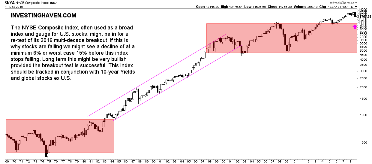
The New York Stock Exchange Index (NYSE) is an extremely important gauge of overall market health. Likewise, the NYSE Composite Index is an important indicator to watch for understanding U.S. stock market health. In a time where some are fearful about a global market crash in 2019 it is imperative to also look into the dominant trend of the NYSE Composite Index. This article features highlights of the NYSE Composite Index 50 year long term chart.
Interestingly the New York Stock Exchange says on its own site that is has been the “premier exchange of choice for innovators, visionaries, and leaders for over 225 years” but also that “during global events, turmoil and volatility, investors turn to the NYSE”.
The importance of the NYSE Composite Index
Wikipedia provides some more detail on the NYSE Composite Index saying that it is a stock market index covering all common stock listed on the New York Stock Exchange, including American depositary receipts, real estate investment trusts, tracking stocks, and foreign listings. It also says that over 2,000 stocks are covered in the index, of which over 1,600 are from United States corporations and over 360 are foreign listings.
This broad coverage across different levels of market cap as well as industries is the reason why the NYSE Composite Index is a reliable indicator for overall market health.
The NYSE Composite Index 50 year long term chart
In our leading indicators for a potential global market crash we included the Russell 2000 as well as the German DAX. However, a complementary indicator would be the NYSE Composite Index 50 year long term chart with its dominant trends. We did not include it in our previous article just to keep the list of leading stock indicators concise.
What can we conclude from the NYSE Composite Index 50 year long term chart?
- First, there are 3 distinct periods in terms of secular and dominant trends. The period until 1982-1984 was a long term consolidation period, there was a giant rise until 2000, and then another consolidation between 2000 and 2015.
- Second, since 2016 we are technically in a new period which may be setting up for another giant bull market. At least, that’s what we see on the long term chart between 2016 and 2018.
- Third, the NYSE Composite Index seems to be weakening now, which is no surprise given recent market turmoil. But the million dollar question is how low the NYSE Composite Index will fall.
The NYSE Composite Index 50 year long term chart suggests there is no issue if this index would fall to the 11,000 level, even not to the 10,000 level. It would present a normal breakout test.
NYSE Composite Index 50 year still bullish
Provided the 10,000 level holds strong, and, preferably, the 11,000 level holds up, there is no issue whatsoever in the bigger scheme of things. It would simply validate the thesis that a new long term bull market in stocks started in 2016.
We believe it is important enough to consider the NYSE Composite Index together with the leading risk indicators Russell 2000 and 10-year Yields. All combined will reveal the risk level and their impact on leading stock indicators.
Below is the NYSE Composite Index 50 year long term chart with our annotations.
TOP CRYPTOCURRENCIES TO BUY: Which top crypto tips are flashing a BUY signal now? Which to avoid? Top notch guidance on how to play the grand bull market in crypto from InvestingHaven’s research team, only for $2 per week. Crypto & Blockchain investing service >>


