


After coming off the of March lows with a decent rally into the early summer, the cryptocurrency benchmark is now consolidating. With stocks you might see this kind of action because the market is waiting for some type of news before sending the price one way or the other way.
While the wait goes on, sideways seems to be bitcoin’s preferred direction, at least for the short term.
What the news is doesn’t matter, from the standpoint of pure price chart analysis. Where to place stops, where to perhaps add to positions — these questions may be answered by locating significant price support and resistance levels. With that in mind, let’s take a look at daily, weekly and monthly price charts for Bitcoin, annotated to suggest possibly key areas.
Here’s the daily chart of the New York Stock Exchange Bitcoin Index:

I wrote about the possibility of a low in March right here. The rally kicked off right around the time of April Fool’s Day and continued until the end of June. Today In: Money
With 2 lows since then in the 9595 area, you can see how the price has been consolidating through the rest of the summer. The uptrend line is broken in mid-July.
If the price drops below that 9595 level, it would indicate a breakdown of the range — note how close it is here to the underneath of the Ichimoku cloud.
Here’s the weekly chart:
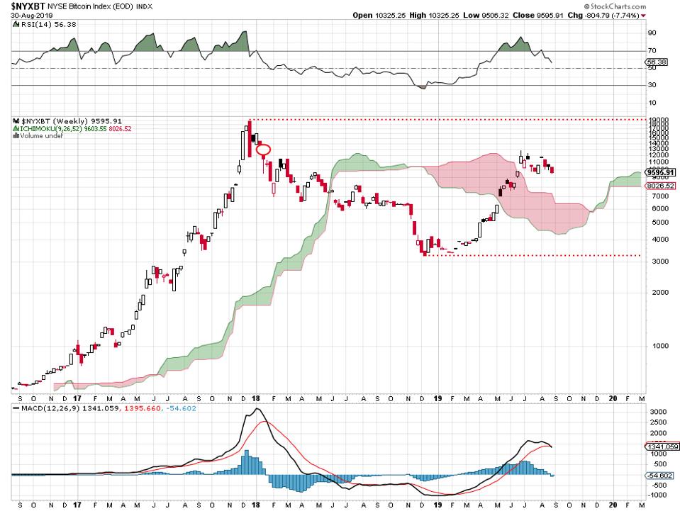
You can see how the price is consolidating on this longer-term time frame: from the high way up there near 19,000 in late 2017 to the late December, 2018 low just above the 3000 level.
It looks as if the rally took a shot at the big gap down that hit the market in January, 2018 — and couldn’t fill it. Will bitcoin trade between the high and low on this chart for months or years or for just a few more weeks? I don’t know.
A breakout above 19,000 or a breakdown below 3200 would change the picture, for sure. That’s quite a price range, by the way.
Here’s the monthly chart:
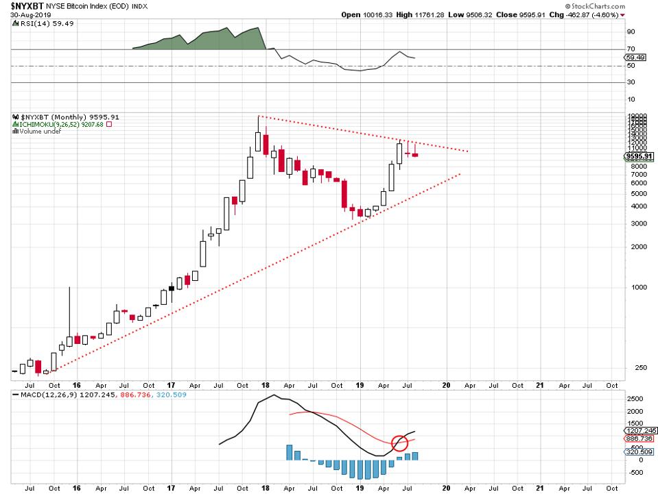
The long-term uptrend remains in place as long as the price stays above that dotted line connecting the lows from late 2015 onward.
A close or 2 above the downtrend line from the late 2017 high would suggest a re-test of that peak. The not always-reliable but interesting moving average convergence/divergence (MACD) indicator below the chart is interesting.
This is a price chart-only analysis without reference to the underlying fundamentals, stories or news in the cryptocurrency world.
Author: John Navin


